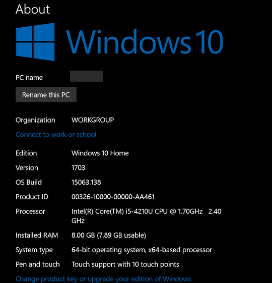
About Your PC
If you’re running Windows 10, you can get a lot of details about your PC by typing one word and doing one click.
Yes you can. So step right up and read all about it!
You can learn what version of Windows you have, what version of Windows you have, how much RAM your PC has installed, what kind of processor(s) and more. Plus you can see your computer’s name and rename it to something else just by clicking a button and typing in a new name for your PC.
If you are using Windows 10, just type ABOUT in the taskbar search (Cortana) and click on “About your PC” when it appears at the top of the search results.
See? You’re PC info at your command!

My poor old broken down work PC 🙂
Don’t change the name of your PC to EB, or you’ll be sorry!


Thanks for another good tip…among thousands!!!
Hope you don’t mind a suggestion: I find that the font that you use for the text of your InfoAves and newsletters a bit hard to read. The style is OK (Calibri?), but it appears as light gray, fine lines to us readers, not enough contrast or “body.” It needn’t be boldface, but perhaps Trebuchet or even Times Roman would be more readable. You might want to canvass your readers to affirm – or tell me that it must be my eyes…
This InfoAve came up as a very readable black on my computer.
The print appears gray on my screen as well.
Grace, I don’t know if you can see my answer to Dick, so I’ll copy it for you too:
It all depends on your video card, browser, and email settings. The newsletter uses standard Arial 12 pt.(medium). Font color is black. The background is white. On the InfoAve Website it uses generic Sans Serif medium. You can look at the screen shots of our newsletter and our InfoAve web site (at the bottom of my reply) and compare what you see on your screen to the pictures. I am not sure why you would see black font as “gray”. But I often check out the site’s appearance and newsletter appearance on other devices and other computers (Android tablets, PCs, etc.) and I’ve never seen gray font – since the font in the code is #000000 (Black) I have no explanation why you see it as gray. You can increase the font size by using your mouse wheel & control key
Honestly, we have never had anyone ever suggest we use a different font or that our fonts were gray. Other than your browser settings or your display settings, I cannot guess why you see what you’re seeing.
Here are the screen shots – does the font look gray and hard to read on these screen shots?
InfoAve Premium Newsletter
InfoAve Web Site
Sorry I’m responding so late, I just saw this message. The print on the screenshots is black. very legible, It is definitely not like the grey color I was seeing.
It all depends on your video card, browser, and email settings. The newsletter uses standard Arial 12 pt.(medium). Font color is black. The background is white. On the InfoAve Website it uses generic Sans Serif medium. You can look at the screen shots of our newsletter and our InfoAve web site (at the bottom of my reply) and compare what you see on your screen to the pictures. I am not sure why you would see black font as “gray”. But I often check out the site’s appearance and newsletter appearance on other devices and other computers (Android tablets, PCs, etc.) and I’ve never seen gray font – since the font in the code is #000000 (Black) I have no explanation why you see it as gray. You can increase the font size by using your mouse wheel & control key
Honestly, we have never had anyone ever suggest we use a different font or that our fonts were gray. Other than your browser settings or your display settings, I cannot guess why you see what you’re seeing.
Here are the screen shots – does the font look gray and hard to read on these screen shots?
InfoAve Premium Newsletter
InfoAve Web Site
I am in agreement with Dick Boera. But, I am seeing it on many websites. I thought maybe it was my old eyes. I highlight what I want to read and it is easier.
It could be as simple as adjusting the angle or height of your monitor/screen, plus you do have contrast and brightness adjustments on most screens as well! Try viewing at different angles or height.
But I do find that different web pages vary in the clearness of text, try enlarging the page as suggested , which will increase the size of the text and make it appear more bold.
LOL, Jeff.